Transforming complex energy data into personalized customer action
I designed a scalable Home Energy Usage experience that translated cohort comparison, usage projections, and personalized recommendations into a trusted coaching flow for millions of households.
Framing complex energy data as personalized coaching
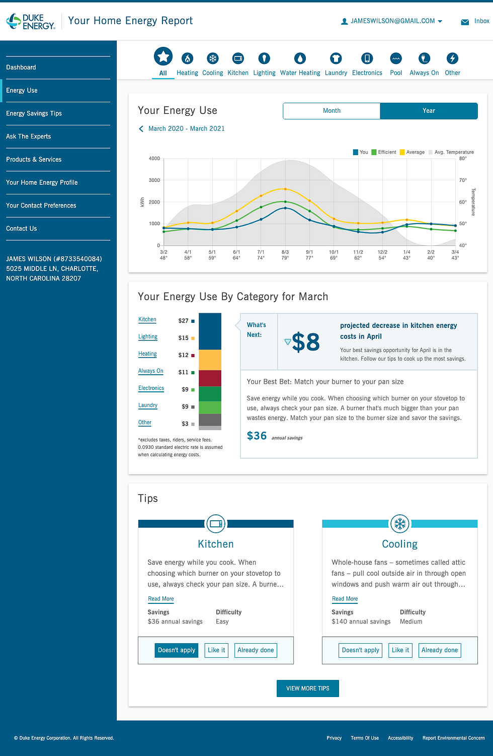
I helped turn historical usage, cohort comparisons, and projected energy data into a responsive experience that customers could understand across desktop and mobile.
The interface leveraged shared design system patterns such as navigation, typography, buttons, links, icons, and segmented controls to keep the experience consistent while supporting a dense data story.
What does this demonstrate?
-
Product vision at scale
-
Responsive product execution
-
Translation of data models into customer-facing UX
-
Business and customer outcome framing

Making energy comparison actionable, not just visible
I designed the core comparison view so customers could see their usage against similar homes, review historical trends, and understand projected changes over time.
Design system components such as icons, navigation, typography, links, and segmented controls helped create a repeatable structure for exploring multiple energy categories without making each view feel custom-built.
What does this demonstrate?
-
Data visualization strategy
-
Cohort comparison UX
-
Decision support for behavior change
-
Reusable framework across energy categories
Building trust by explaining the data behind the benchmark
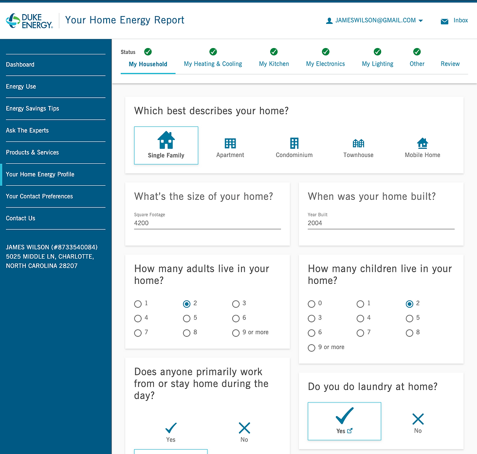
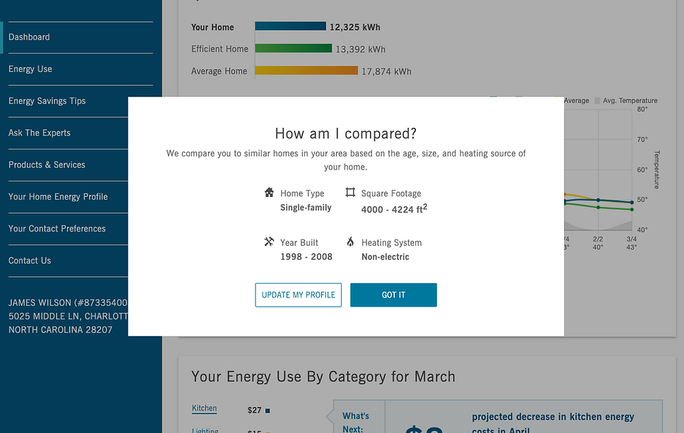
I connected comparison insights to profile transparency by showing customers which household attributes influenced their cohort and giving them a clear path to update inaccurate information.
The modal used design system typography, icons, and button groups to make a complex data-quality loop feel understandable and low-friction.
What does this demonstrate?
-
Trust and explainability
-
Customer agency over model inputs
-
Connection between profile data and recommendation quality
-
Staff-level thinking across data, UX, and behavior

Creating a scalable action system from recommendations
I designed Tips as a centralized recommendation experience where customers could browse, sort, save, dismiss, and revisit actions based on savings, category, and difficulty.
Design system tables, buttons, links, icons, typography, and navigation patterns supported dense information while keeping the focus on prioritization and repeat engagement.
What does this demonstrate?
-
Information architecture for dense content
-
Personalized recommendation management
-
Feedback loops through liked/done/not relevant states
-
Scalable pattern for future tips and categories
Complex data translation
Turned usage, cohort, and projection models into customer-facing experiences that made energy behavior easier to understand and act on.
What does this demonstrate?
Trust through transparency
Connected comparison data, profile inputs, and explanatory moments so customers could understand why recommendations were relevant.
Scalable coaching framework
Structured charts, categories, tips, and feedback states into a reusable system that could support millions of households and repeated engagement.